Scheer Sweets Packaging Design
At-Home Bakery Brand
Playful, cohesive packaging designed to create a memorable unboxing experience for a small bakery brand.
-
Packaging Design
Brand Application
Print Design
Visual Identity
(Logo and full brand identity were designed separately and are featured elsewhere in my portfolio.)
-
Create packaging that feels simple yet fun, reinforces brand personality, and turns every order into a thoughtful, memorable experience.
-
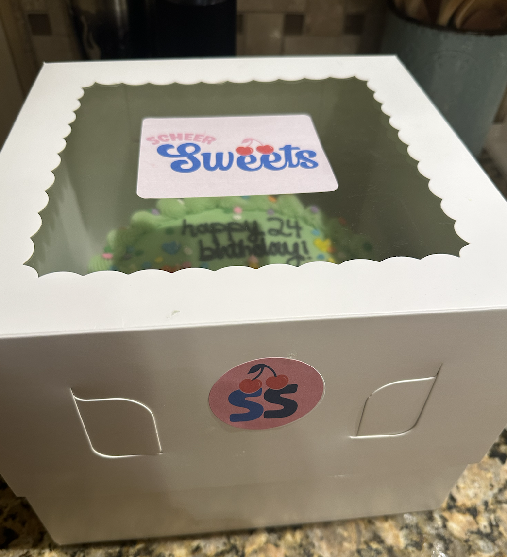
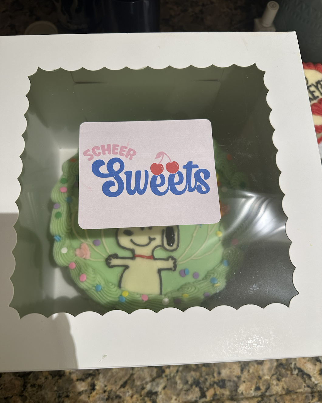
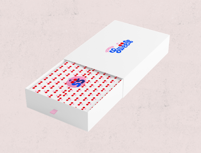
For Scheer Sweets, I designed packaging that builds directly off the brand identity. Cherries — a key element from the logo — were incorporated to reflect both the slogan “Life’s better with something sweet 🍒” and the idea of being the cherry on top.
Personalized tissue paper adds a special moment when customers open the box, while logo stickers use a secondary logo variation designed specifically for smaller surfaces. Every detail was created to feel cohesive, cheerful, and intentional.
-
Strong brand recognition through consistent visuals
Elevated unboxing experience for customers
Packaging that feels personal, fun, and on-brand
-
Designed to feel joyful, thoughtful, and unmistakably Scheer Sweets — right down to the last detail.