Scheer Sweets Brand Identity Design
At-Home Bakery Brand
A playful, sweet brand identity designed to feel fun, recognizable, and full of personality.
-
Brand Identity Design
Logo Design & Variations
Color Palette Development
Visual System for Print & Digital
-
Create a fun, cohesive brand identity that reflects the personality of a small at-home bakery while feeling memorable and inviting.
-
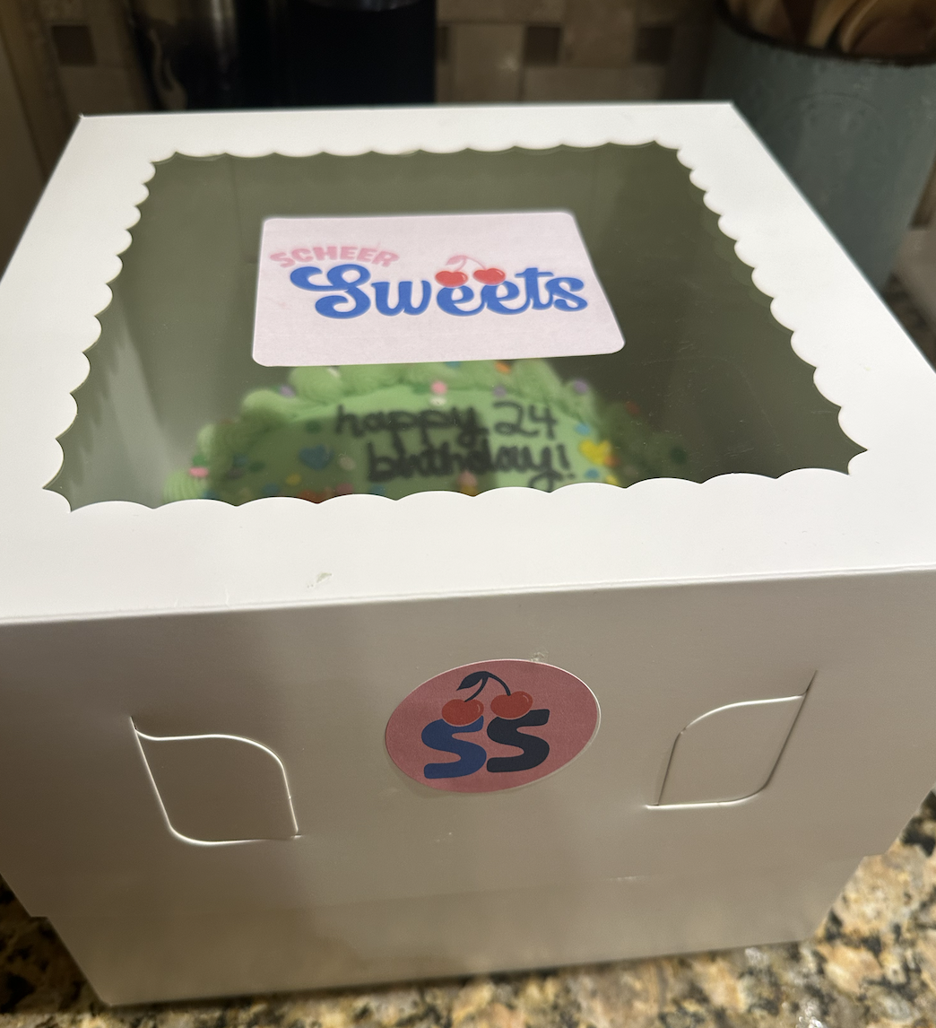
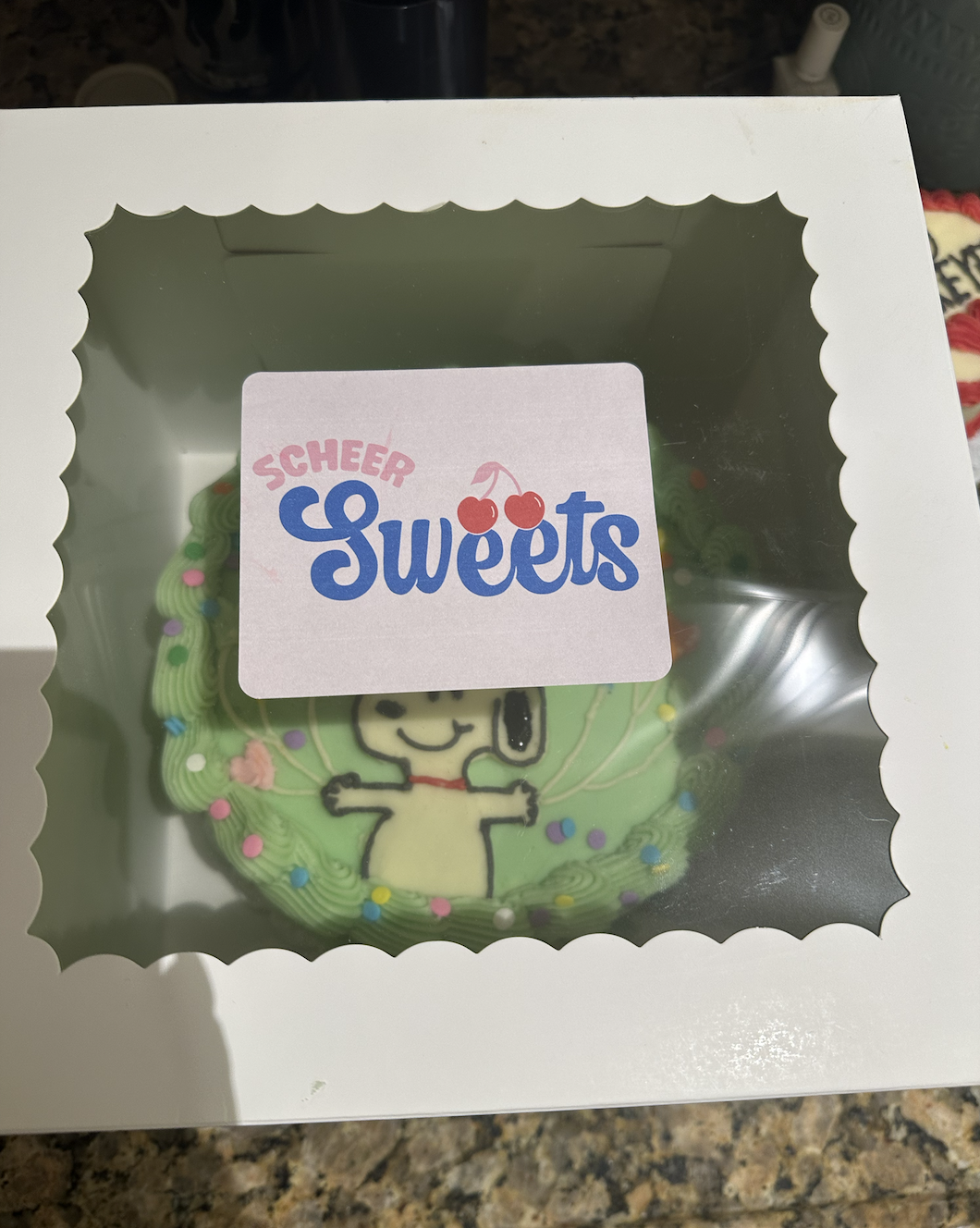
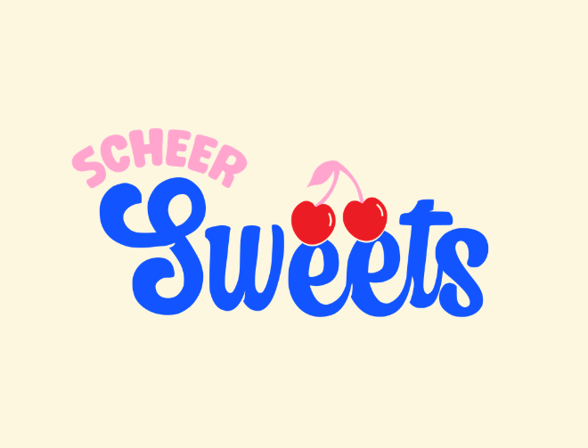
For Scheer Sweets, I developed a brand identity inspired by my love for cherries and the idea of something being the cherry on top. Cherries became a key visual element within the logo to reinforce the brand’s sweet, playful tone.
The color palette was designed to feel fun and attention-grabbing, using pinks, reds, and a bold blue to evoke “cute bakery” vibes while still standing out across packaging and social media. Alongside the primary logo, I created a secondary logo variation sized specifically for stickers, packaging, and social platforms to ensure flexibility and consistency across all brand touchpoints.
-
Strong, recognizable visual identity
Flexible logo system for print, packaging, and digital
Branding that feels cohesive, playful, and memorable
-
A sweet, personality-driven brand designed to stand out — and always feel like the cherry on top.