
Auto Insurance Branding
Brand Identity • Logo Design • Color System • Visual Direction
The Auto Coverage is a digital platform designed to help users get matched with the right auto insurance providers based on their needs and location. The brand needed to establish immediate trust, strength, and approachability—especially in a competitive and often impersonal industry.
My task was to create a brand identity that was modern, bold, and primarily geared toward a male audience—while still being inclusive and appealing to women. The brand had to stand out in scrolls, feel credible, and drive users to take action.
Project Overview
The Goal

Build a brand that feels strong, clean, and trustworthy
Avoid visual clichés often associated with insurance (e.g., shields, cars, clip art)
Appeal to a male-leaning audience through bold design, while remaining neutral enough for broad appeal
Visually tie in the road and movement without being heavy-handed
Branding & Logo Design

The logo strikes a balance between minimalist strength and smart symbolism. It’s clean and geometric, but contains subtle hints of the road—giving users a sense of direction and purpose.
Logo Concept
Simple Wordmark with Iconic Detail: Sleek typography paired with a refined design element that hints at a road or path—evoking motion, progress, and clarity
Modern & Strong: The visual style suggests control, confidence, and speed—qualities that align with both driving and smart insurance decisions
Flexible Across Formats: Designed to work on digital platforms, app icons, social avatars, and promotional materials
Color Palette
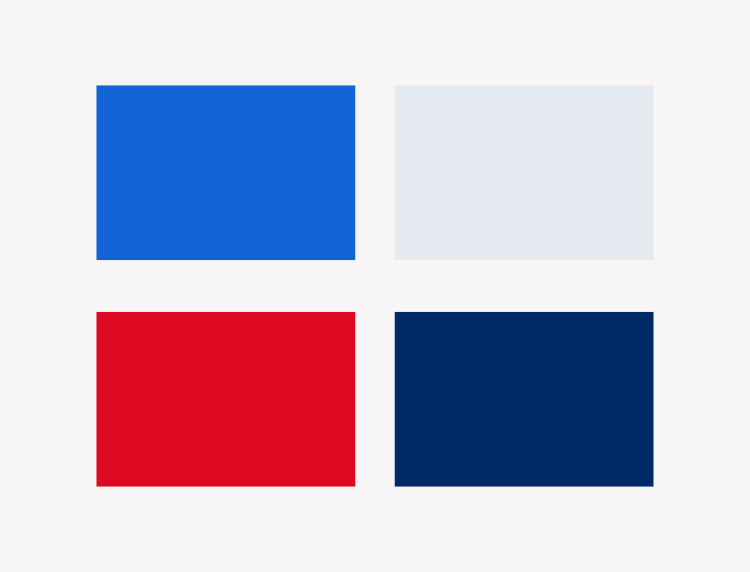
The brand uses blue and red to strike an emotional and psychological balance:
Blue: Conveys trust, stability, and professionalism—essential in financial and insurance-related decisions
Red: Adds energy, urgency, and masculine edge—without being aggressive
The combination is high-contrast and attention-grabbing, while still feeling refined
Social Media Application

The branding system was built with performance in mind across both digital and social media platforms.
Visual Traits
Bold Typography for strong headlines and short, persuasive CTAs
Plenty of Space for visual clarity in tight layouts (ads, mobile UI, etc.)
Consistent Iconography & Graphics using directional lines, arrows, and subtle motion cues to reinforce the road theme
Social-Ready Design
Logo and branding adapted for Instagram, TikTok, and ad creative
Clear visibility even at small sizes
On-brand assets for reels, stories, and ad banners
The Auto Coverage now stands out as a bold and trustworthy brand in a sea of generic insurance competitors. By merging smart design, subtle symbolism, and high-contrast visuals, the brand communicates clarity, action, and confidence—on the road and on the screen.