A Personal Bakery Brand
Logo Design • Brand Identity • Packaging Design
Scheer Sweets is my passion project—a personal bakery brand rooted in warmth, joy, and (of course) sweets. As a designer and baker, I wanted to create a visual identity that felt distinctly mine: playful, polished, and instantly recognizable.
Project Overview
The heart of the brand began with a simple idea: the cherry on top.
Cherries are one of my favorite fruits, and they’ve always symbolized the final touch—the detail that makes something feel complete. It felt natural to use them as the core visual for my brand. From there, Scheer Sweets was born.
Brand Concept
Visual Identity
I wanted the brand to feel clean and modern, but still fun and full of personality.
Logo Design
Primary Logo: A custom logotype paired with a cherry icon that doubles as a signature
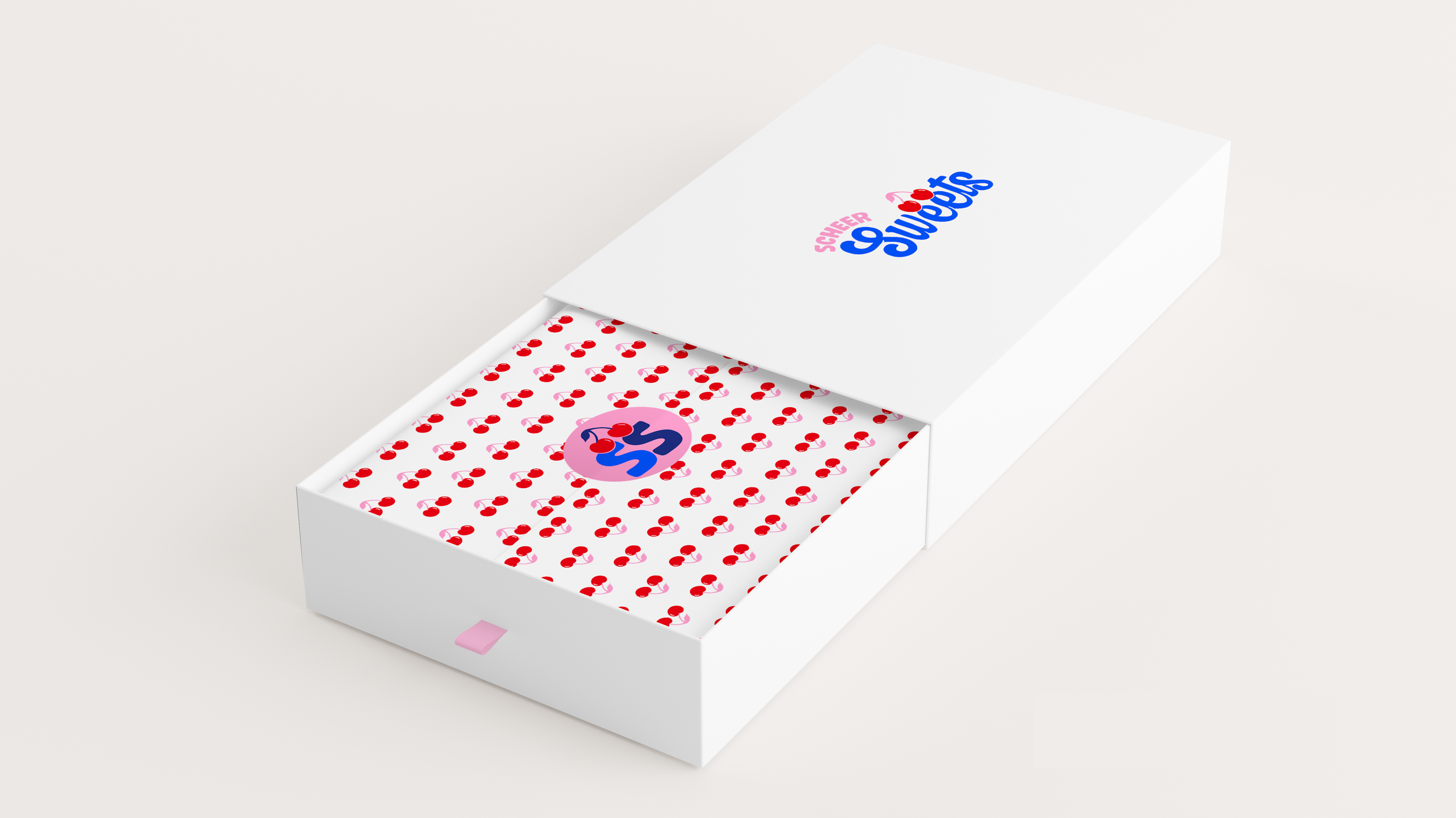
Submark: A compact circle version of the logo used on packaging and stickers
Style: Minimal, memorable, and versatile across digital and print
Color Palette
Bright Blue: Adds a fresh, modern twist that feels unexpected for a bakery
Soft Pinks: Ground the brand in sweetness and femininity, while keeping it warm and inviting
Contrast: The palette plays with bold and soft tones to create a unique, recognizable look
Packaging Design
Since Scheer Sweets is a small-batch bakery, the packaging needed to be simple, practical, and brand-forward.
Sticker Seals: A circular version of the cherry logo used as seals for every box and bag
Minimalist Aesthetic: Cherry or tissue paper with white packaging lets the sweets shine, with the brand acting as a subtle finishing touch
Consistency: Every package carries the cherry icon for instant recognition, no matter the dessert
Vibe: Sweet, joyful, personal
Voice: Friendly, approachable, and playful
Goal: Build a brand that feels like me and resonates with others at first glance


